Designing for iOS 14 Home Screen Widgets
•
Richard Giles
Home Screen Widgets are exploding.
If you’re an app developer, you’d know when iOS 14 was launched in September, Home Screen Widgets became the flavour of the month. While Android users will tell you this is old news, iPhone users across the globe not only raved about new widgets, they figured out a way to use them with Shortcuts to personalise home screens and share examples on Twitter and TikTok (Wired: How to Trick Out Your iPhone Home Screen in iOS 14). There’s now even an app to help you called Widgetsmith.
Over the following weeks, app developers released widgets with current local weather radar images, trending movies through to stock prices and news headlines.
In the not so distant future, the app with (the most) widgets will win.
So, how should a mobile app developer design for Home Screen Widgets? What should a good widget focus on? What guidelines are there, and what style should we follow?
Expensive Real Estate
Nick Hobbs from Broadstreet makes a fantastic point on John Koetsier’s podcast; because iOS 14 no longer adds apps to your home screen — it now uses the App Library — widgets become key to owning a place on someone’s home screen. This means that a widget that is helpful will win over those that are only vying for attention.
Which leads straight into our main design principles for widgets, make them useful: personal, informational, contextual and actionable.
Personal
Do you know when, where, and how people use your app? Consider using that information to provide more timely and useful features through your widgets.
It feels like this should go without saying, but when you’re deeply involved in developing a mobile app, you can sometimes forget that everyone uses an app in their own way. So if you have some insight into the person using the phone, it helps to surface those things that are personal to them.
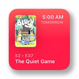
TV Forecast: Small Home Widget with upcoming TV shows (don’t judge me).
TV Forecast, developed by Matt Comi, is an app that helps you track and discover your favourite TV shows. Its widget shows your next upcoming episode or your progress for your favourites.
Health Mate, an app to support the range of Withings’s health devices (scales, watches, thermometers, blood pressure monitors, etc.) has a neat little widget that provides the latest measurements. Jump on your Withings Scales in the morning, and you’ll see your weight, walk to the bus and see your step count, take a blood pressure reading and see your Systolic and Diastolic readings.
Informational
For apps that provide information, then it makes sense to surface that information within a widget so long as that information is dynamic. Any news app should have a widget already (but surprisingly few have), providing “glanceable” news on the go.
Again, to use Apple’s own News app as an example, it allows a person to add a widget and show a specific topic, or “today’s news, including top stories.” You can add the widget and then use 3D Touch/Haptic Touch to reveal the “Edit Widget” menu to change the topic.
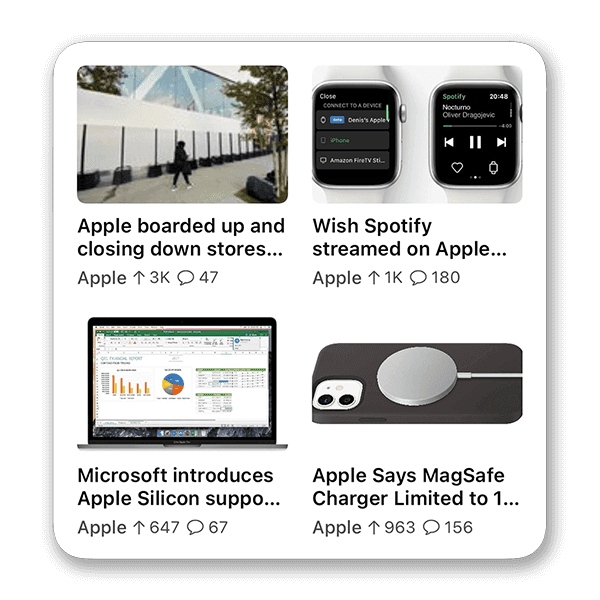
Apollo: Large Home Widget with the latest Apple subreddit posts.
For Reddit fans, Apollo has a great range of widgets, which is not surprising if you know of Christian Selig's work. Included is a widget for a single post from a selected subreddit, an overview of multiples posts in a list or a grid, a wallpaper widget which rotates through photos from image-heavy subreddits, a link to favourite subreddits, and specific widgets for Showerthoughts and Jokes.
Contextual
Using contextual information to inform a widget is a little more sophisticated, but certainly adds a “surprise and delight” dimension to your app. In fact, it can intersect but extend the Personal dimension we’ve already explored.
The question is, how can you tap into the device’s context — time, place, weather, activity, you name it — to provide even more insightful features?
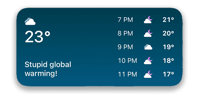
Carrot Weather: it’s irreverent Medium Home Screen Widget with the hourly forecast.
Carrot Weather only uses time and place, but it's effective. I usually want to know the current weather for my current location. Carrot offers this and a little bit more: the next several hour's forecast, the daily forecast for the next few days, or even a weather map showing the radar. All this with a dose of Carrot’s signature ‘snark’.
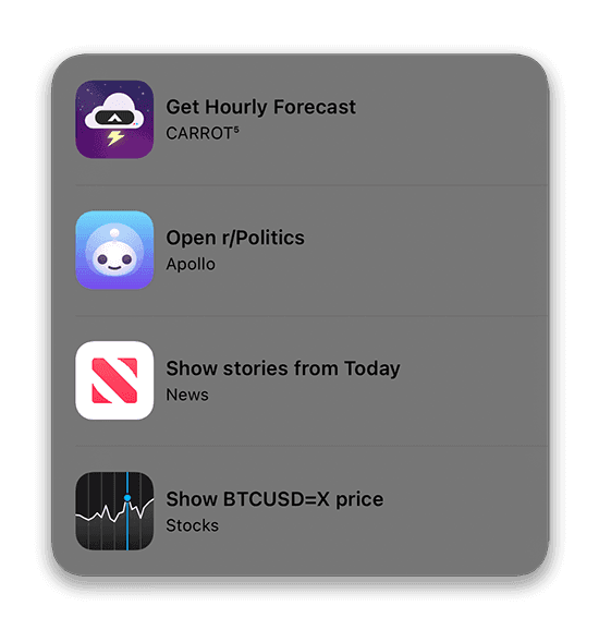
Siri: Large Home Screen Widget with suggestions based on time, day, your habits, connected devices, etc.
The next step up is Apple’s Siri Suggestions widget. Given that they own the operating system, they can surface a lot more than mortal developers, but I think this illustrates just how powerful widgets can be with extra context. App Suggestions displays apps based on usage patterns like location, time of day, connections, and even specific parts of apps that you use. I’ve seen app’s suggested based on the time of the day, like a prompt to send a message to my wife in the morning; connected devices, like opening Music or Soundcloud when I connect my AirPods; and a sports tracking app, when I’ve finished exercise. It does this because it knows when, where, and how I’ve used these apps before.
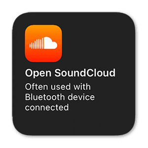
Siri: Small Home Screen Widget with a suggestion when I connect my Airpods,
Keep in mind that widgets don’t support continuous, real-time updates. iOS may adjust the limits for updates depending on various factors. Your widget’s ideal update frequency will depend on how often the data changes and how often people need to see new data. But if that’s more often than is feasible, provide a way to indicate when it was last updated.
Actionable
Interestingly, Apple doesn’t list ‘actionable’ as a key principle of widgets, perhaps because this has been tackled by 3D touch for several years (hold an icon down and see a menu of app actions you can take). Their Human Interface Guidelines event state, “Although people can tap a widget to see or do more in your app, a widget’s main purpose is to display a small amount of timely, personally relevant information that people can view without opening your app.” However, there are a lot of apps that have a widget that includes a deep link into the app to complete an action (Google calls these Control Widgets on Android). When you’re competing for people’s home screens, then you’ll take what you can get.
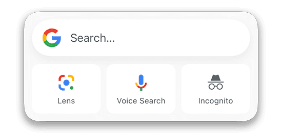
Google: Medium Home Screen Widgets with deep links to app actions.
Want to scan a document, record audio, or take a photo, upload it straight to the cloud? Dropbox provides a widget to fast track the feature. In a similar vein, the Google app includes a widget that links straight to a search, or — more powerfully — their Lens feature, which lets you search, translate, identify objects, complete maths problems, and even tell you what breed a dog is, all just using your camera.
Perhaps it’s not fair to suggest this as a principle. Still, I’ve seen people innovate with much larger technological constraints, so I wouldn’t be surprised if we see some clever people introduce some amazing widgets in the future that include actions…Apple Gods permitting.
Visual Design
Once you’ve conceptualised the functionality of the widget, the next step is its visual design. Apple provides details on how widgets should be presented, including the available sizes and margins. In general, use the style provided by your app, but take into consideration the following.
Sizes
Widgets come in three sizes, small, medium and large. I’ve used an example of each above.
Small widgets are square, with a size of 169x169 points (which adapt to smaller screen sizes, so make sure you create images for various devices and scale factors by following Apple’s HIG for Images Size and Resolution), and provide a single deep link action. The widget might show several items, like text or images, but selecting it triggers the same action wherever you tap. Keep the amount of information to a minimum in this size widget, at most include only four pieces of info.

Examples of small widget layouts (from Apple)
Medium widgets are rectangular with a size of 360 x 169 points and given they provide more screen real estate they offer more than one deep-link, but be mindful that the recommended hit target is at least 44 x 44 points.
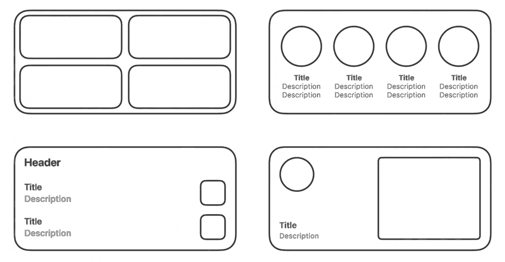
Examples of medium widget layouts (from Apple)
Large widgets are almost square, 360 x 376 points, and also provide more than one deep link.
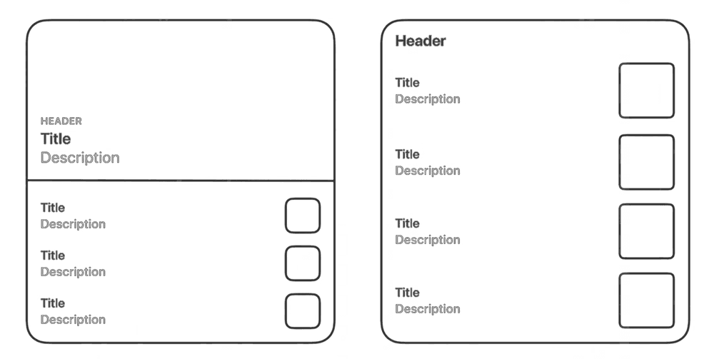
Examples of large widget layouts (from Apple)
Apple suggests that it’s fine to support only one size, rather than offer a scaled-up version of the same functionality.
Patterns
Apple provides some basic patterns for designers to follow to achieve consistency between different app widgets.
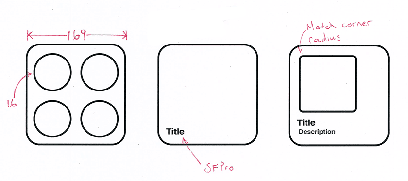
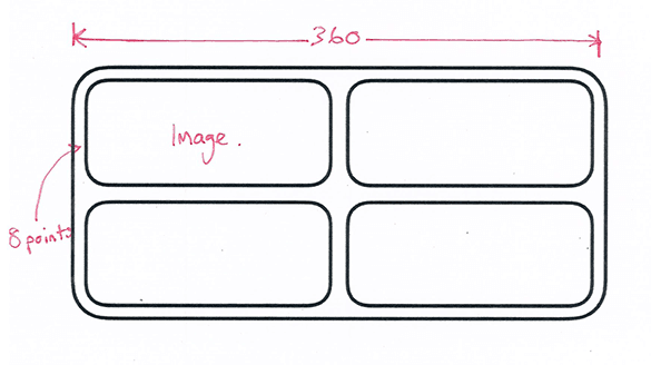
Apple suggests that standard margins of 16 points for text, glyphs, and graphs, be adhered to, but allow 8 points for buttons or widgets containing a background.
Shapes should match the corner radius of the widget, and can be achieved by using the SwiftUI tools in XCode.
“Consider” using SF Pro for the font, which allows the text to scale correctly.
Design for Light and Dark Mode given that dark mode is now fairly well entrenched in the Apple ecosystem.
Include a placeholder when no info is available so that it doesn’t look broken. In most cases, people are using Skeleton Placeholder themes.
Lastly, design a realistic preview to display in the widget gallery so people can get a sense of how it can be used.
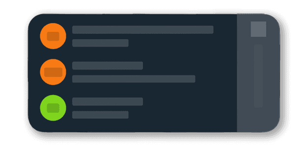
Hey Home Screen Widget placeholder with a skeleton placeholder
A few additional tips offered by Apple are:
Only use a logo if you’re an aggregator, and place it in the top right of the widget.
Please avoid using the app icon and app name in the widget, given the widget has it’s own title and can be linked to your app via its style.
Don’t include text instructions; if the widget isn’t self-explanatory, then it’s not simple enough.
Summary
Hopefully, this provides you with a great primer for planning a home screen widget for your mobile app. There are several ways to do this by making the widget personal, informational, contextual, or actionable.
As is often the case, the key to a successful widget is making it useful, the same principle you should use when designing a new app or feature. Just make sure to do some mobile app testing once it’s complete.
However, if Nick Hobbs is correct, and we have every reason to believe he is, then as a mobile app developer, a Home Screen Widget could be your key to unlocking the most valuable real estate on the planet: people’s home screens.


